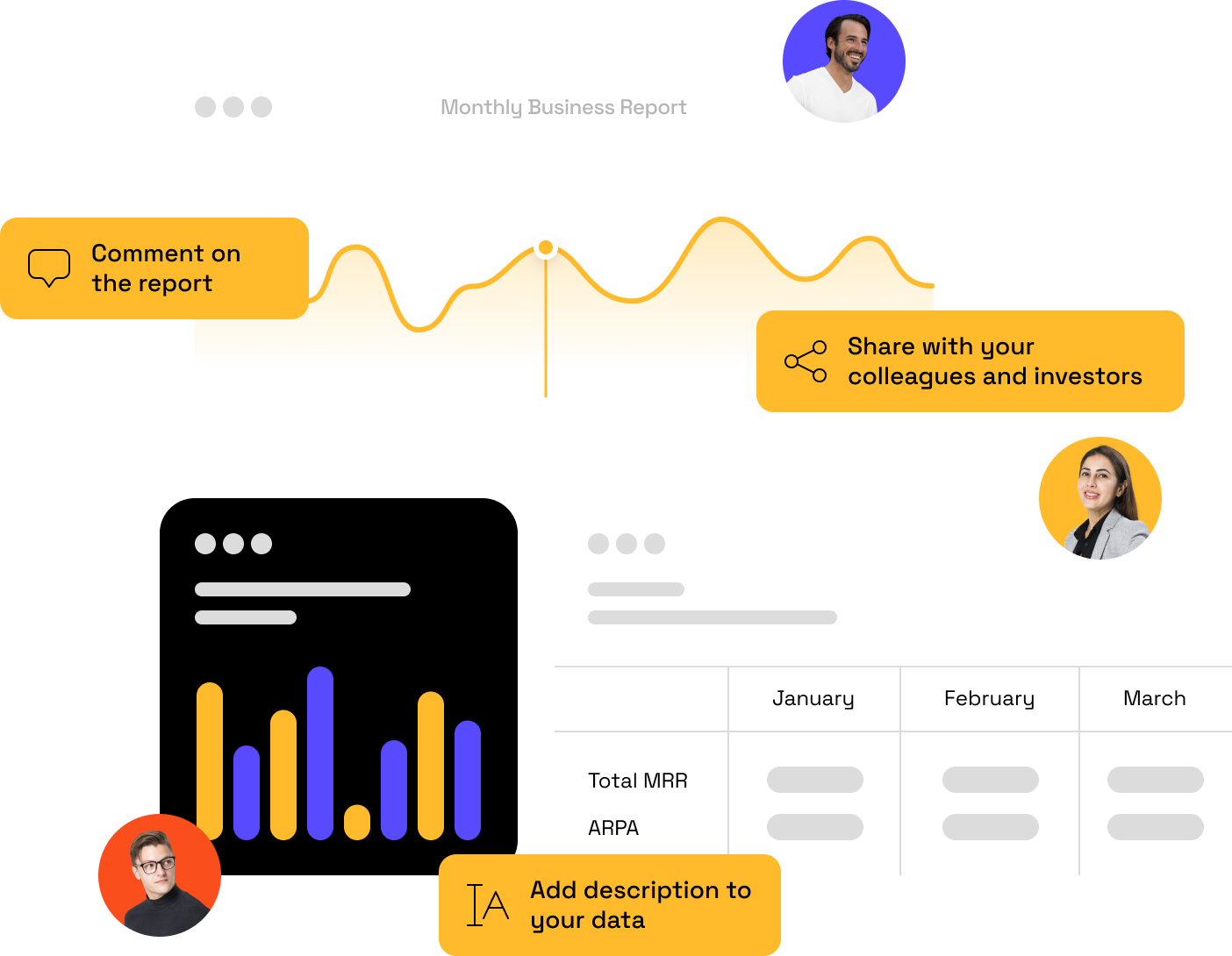
Everything you need to understand and grow your revenue
Probe is all-in-one analytical platform that gives you control and deep understanding of the financial performance of your company
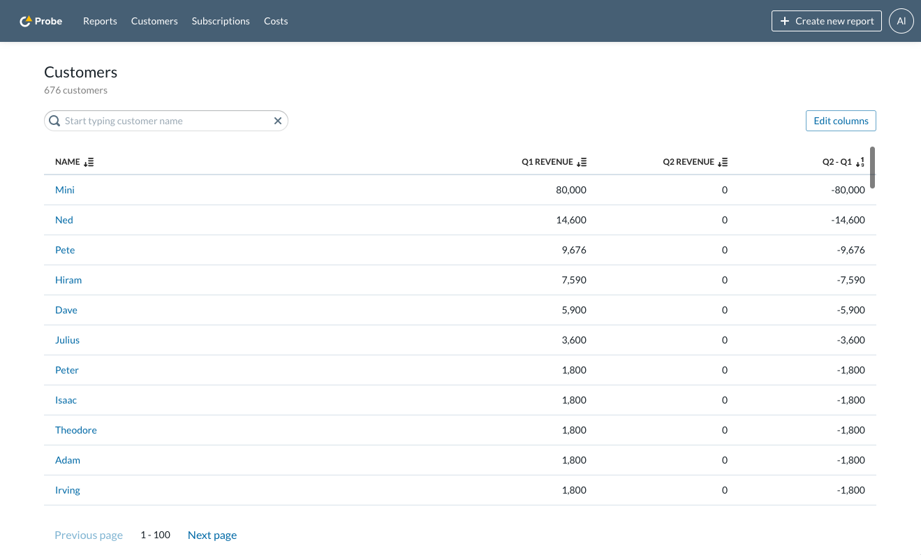
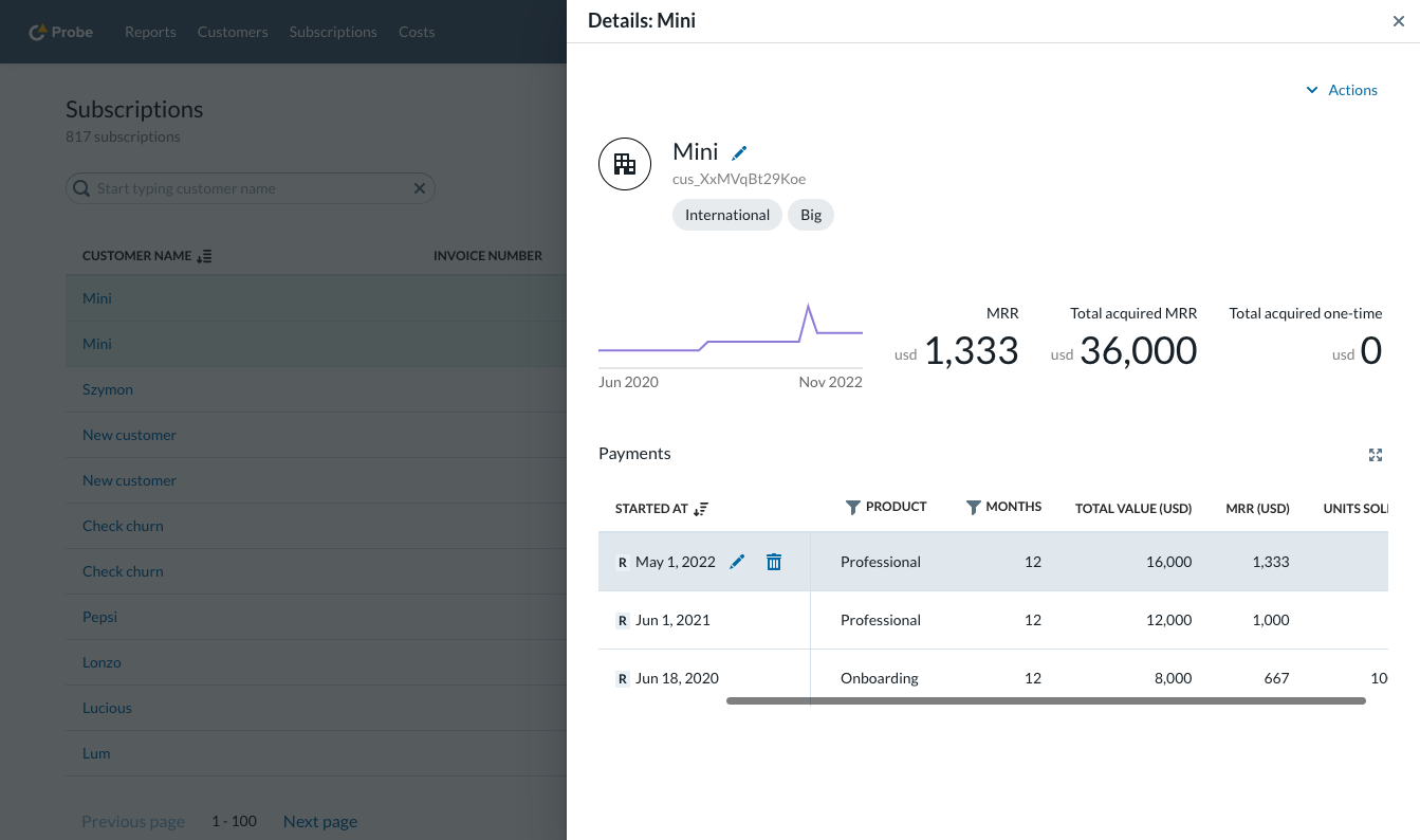
Try Probe for freeAll of your customers in one place
One go to place to get all information about your customer base. Any customer related custom metric at your fingertips.
Flexible all-in-one reporting platform
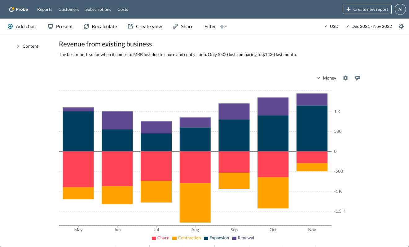
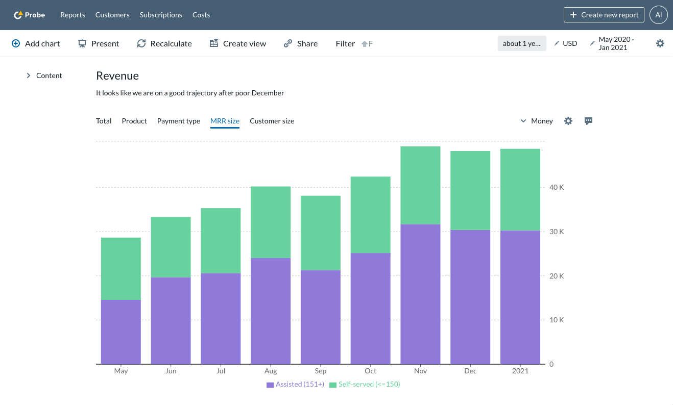
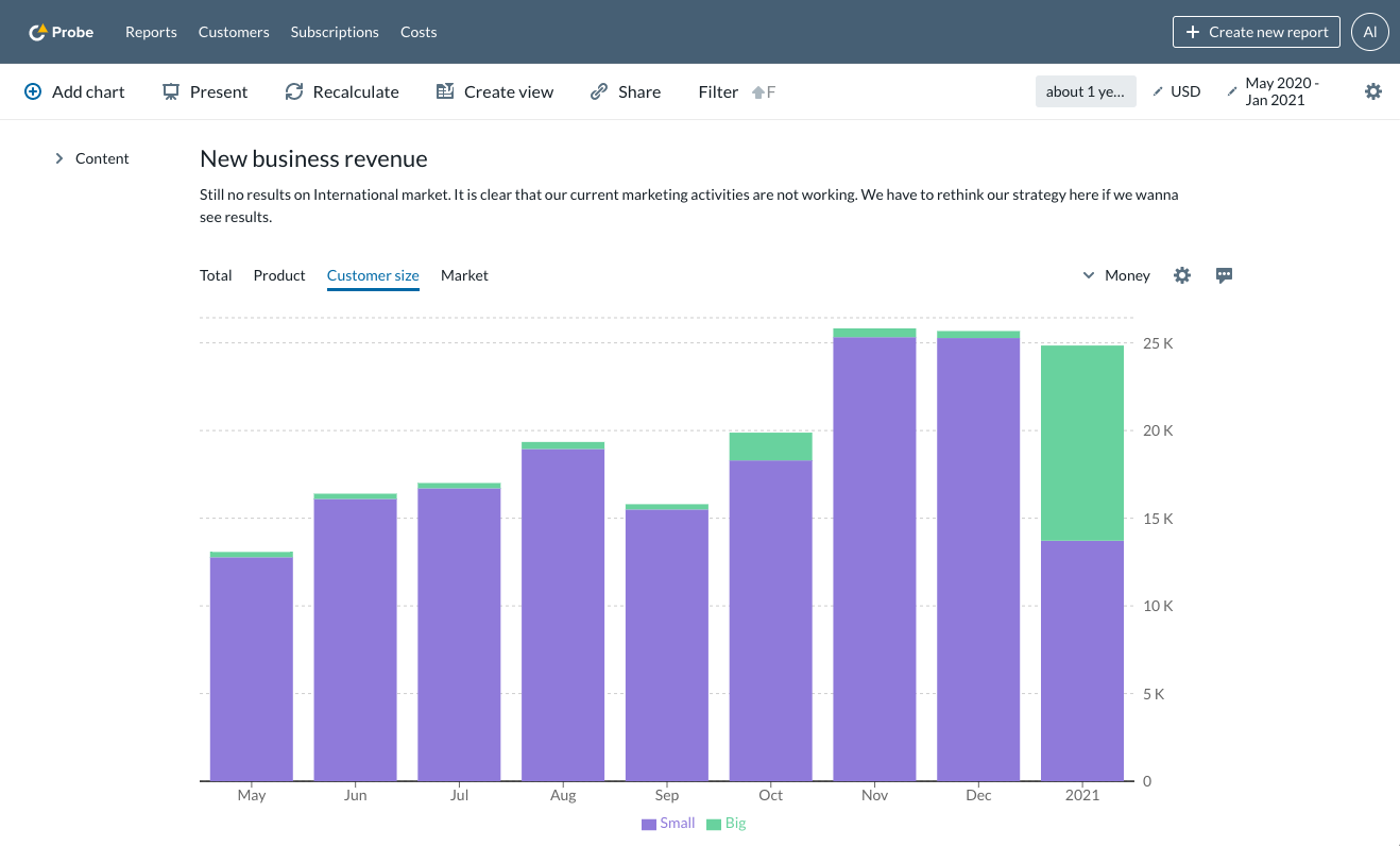
Everything you need to understand growth of your business, from basic revenue charts to dynamic segmentations, understanding of sold quantities, given disounts and corrections.
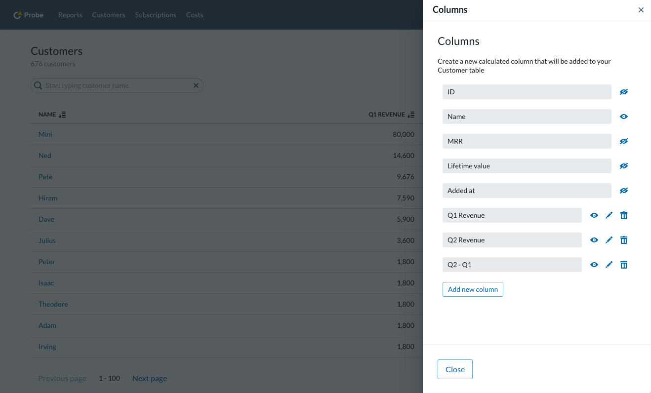
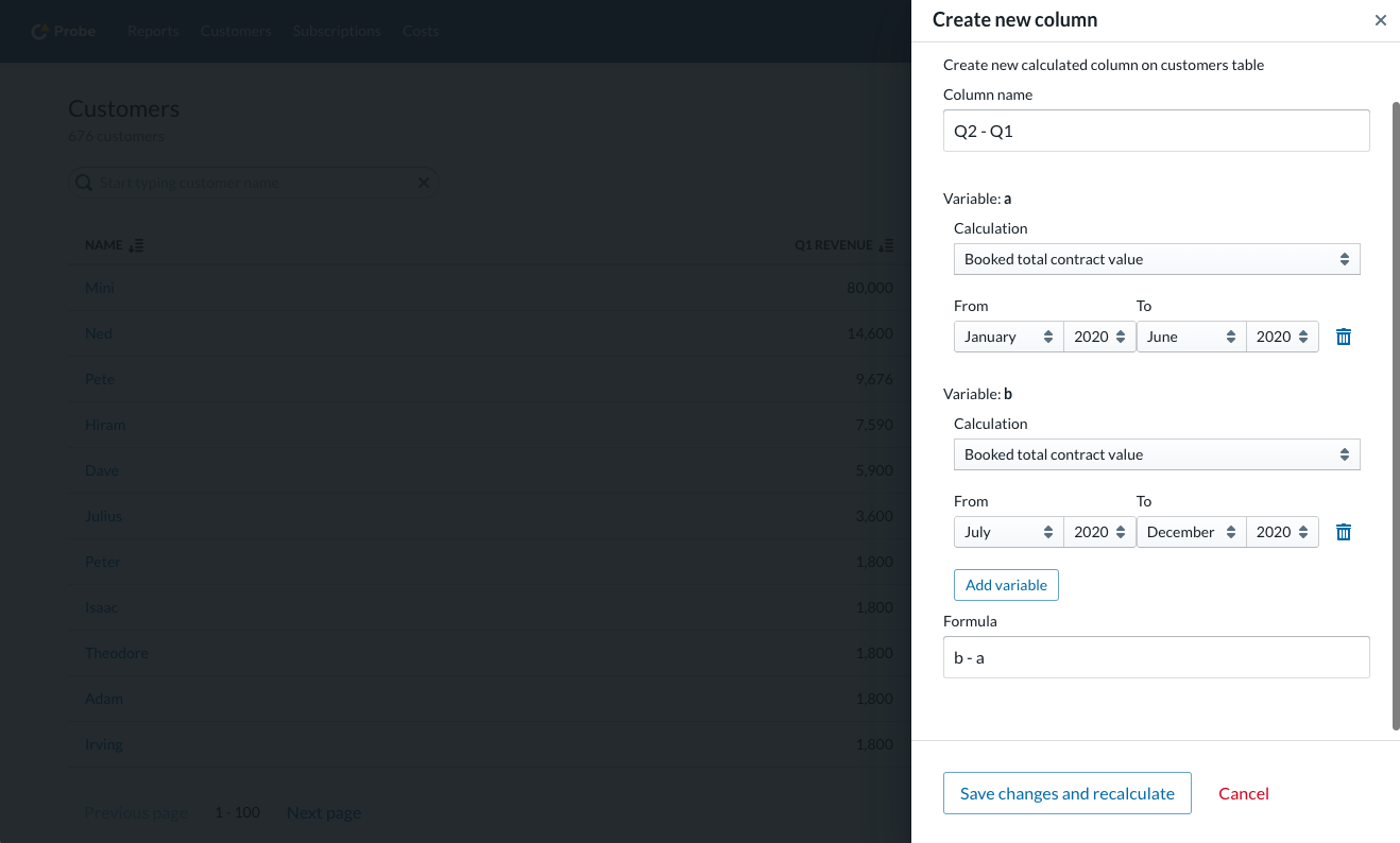
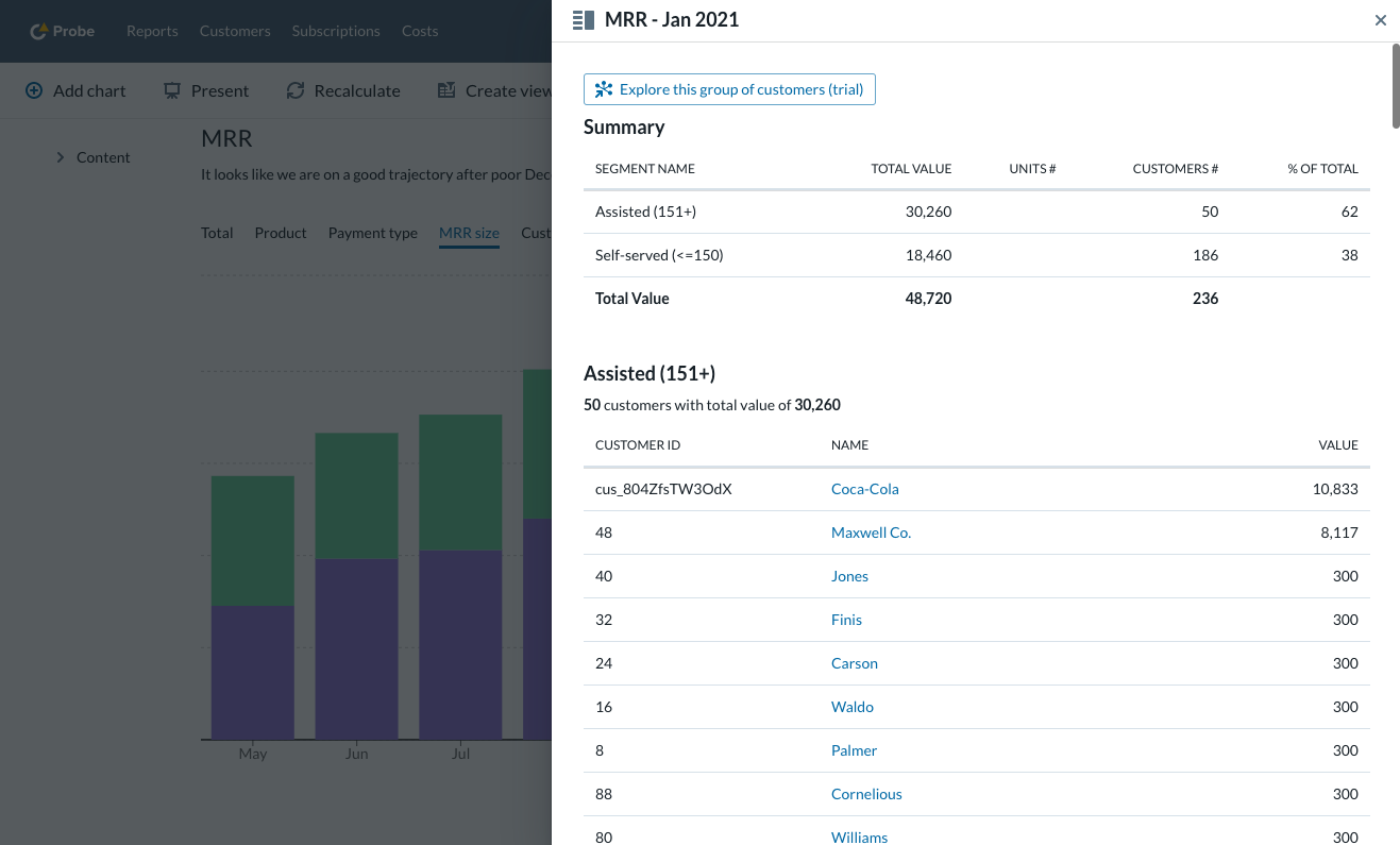
Access details behind every chart and calculation
Data trust is critical for the success of any analytics. You can access details of every metric we show and close your month with confidence that you have not missed a thing.
Learn more about our work with customers
Assisted onboarding
Discovery
A discovery discussion to understand what metrics are important to you and where you store your data.
Data import
We save you time and take full responsibility for historical data import into Probe and ensure data quality.
Monthly report
We review your account together to make sure you trust the numbers you see. We work to set up the best solution for data sync.
Ongoing success
We collect your feedback and automate ongoing data collection so it requires no further work.
Supporting your specific use case
Unstructured data
Calculate your saas metricts from unstructured data such as issued invoices.
Customer identity
Identify customer by other than default attributes, like VAT ID to make it easier on your operations.
Data presentation
Group selected product names into one category or build flexible segmentations representing your business needs.

